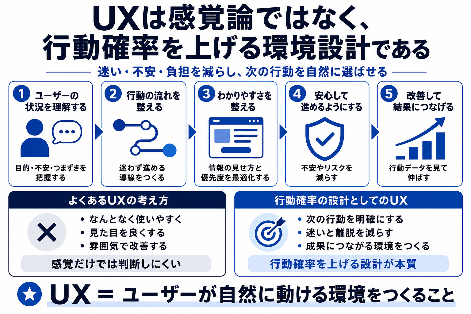
UX Is Not a Matter of Feeling.
It Is Environment Design That Raises Behavior Probability
UX does not end with "somehow easy to use." It is design that reduces hesitation, anxiety, and effort so users are more likely to move toward the action they came to take.
UX should be read through ease of action, not through preference
Whether a screen looks clean and whether users can act are different questions. A polished screen still creates poor UX if users do not know what to do next. A quiet screen can have strong practical value if users can move forward without hesitation.
When UX is treated as a matter of feeling, the discussion easily turns into preference. In practice, UX appears in behavior: form completion rate, abandonment rate, click rate, inquiry rate, purchase rate. What matters is whether users can take the next step.
In other words, UX is not only about beauty. It is design that organizes information, routes, wording, and effort so the probability of action increases.
Reading UX by feeling
- Judging by personal preference
- Holding work inside the user
- Leaving confirmation to people
Reading UX by behavior probability
- Increasing desired actions
- Reducing abandonment
- Making the experience receivable
UX is design that removes the friction lowering the probability that users move toward the action they want to take.
Abandonment does not happen only because users lack interest. A small moment of uncertainty can be enough
Users leave for smaller reasons than we assume. They do not understand what a button means. Input feels troublesome. Comparison material is missing. The price does not feel justified. Error messages are unhelpful. All of these are forms of friction that lower behavior probability.
The important task is imagining where users hesitate. In a form, input fields become friction. On a landing page, anxiety reduction matters. In ecommerce, comparison and checkout matter. In an article, the reason to keep reading can become friction.
UX improvement is not about persuading users harder. It is about reducing the reasons they stop. Every friction point removed raises behavior probability a little.
- Looking only at deliverables
- Leaving no trace of the flow
- Judging by feeling
- Reading response patterns
- Removing blocking factors
- Designing how the experience is received
CVR improvement should be read as a change in behavior probability
When form improvement raises CVR, there is always some behavior change behind it. Did input become easier? Did anxiety decrease? Did errors stop blocking users? Did the CTA become easier to find? We need to read not only the number, but also why the number changed.
Data does not automatically tell us the correct UX answer. But it gives clues about where users drop off and which changes improved behavior. By connecting quantitative and qualitative signals, UX becomes a practical target for improvement instead of a matter of feeling.
CVR is the result, and UX is the environment that produces it. The work is to read the numbers while looking for the factors that stop action.
Look at the relationship before and after the action, not only at a single page
In UX improvement, looking only at the current page is not enough. Where did the user come from? What are they expecting? What do they need to do next? Without understanding the surrounding flow, the meaning of the screen cannot be judged.
Users arriving from search and users arriving from ads have different expectations. First-time visitors and returning visitors need different information. People near purchase and people early in consideration have different anxieties. UX needs to be designed with these situational differences in mind.
The work is not simply fixing the screen. It is fixing the flow of behavior. From that view, UX improvement becomes environment design that supports users in achieving their purpose, not just design correction.
Separate weak use from strong use
UX should be reframed not as appearance or preference, but as environment design that increases the probability that users can act without hesitation.
Weak use
- Judging by preference
- Only stating correct principles
- Handing everything to AI
Strong use
- Reading behavior probability
- Removing drop-off factors
- Making the experience receivable
UX is the work of designing an environment where action becomes easier
When UX is judged only by preference or atmosphere, the places that need improvement become vague. Behavior probability rises when hesitation, anxiety, and effort are reduced and users can naturally move to the next action.
- UX is environment design that raises behavior probability
- Practical knowledge from CVR improvement through form optimization
- Motion as part of information understanding and emotional design