Two-Day Site Renewal:
Reframing It as an Integrated Knowledge Hub
I rebuilt my personal site, Personal Notes, over two days. The work went beyond changing the colors or homepage. I reorganized its articles, tools, case studies, and profile into one structure where thinking, practice, judgment, and implementation feed into one another.
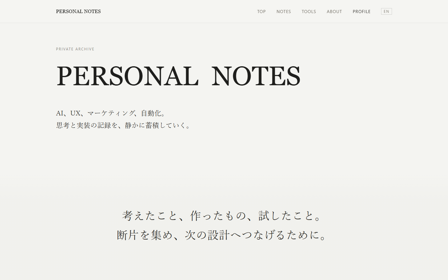
The previous site could show its content, but not the relationships between items
The old homepage was a quiet archive: a large “PERSONAL NOTES” title on an almost-white, slightly warm background, with articles listed below.
The old design was not bad. It worked as a place to collect articles, with enough space to keep the reading experience calm. It served its purpose as a personal archive.
But as the site grew, its structural limits became clear. It had articles, tools, implementation case studies, and a profile, but the interface did not show how they connected.
The main problem was not a lack of content. The site's meaning and structure had not kept pace with its growing body of work.
The goal was not a new look.
A structure that makes the relationships between the site's contents clear.
I redesigned the site's role before its name
The first decision was not about color, layout, or even what to call the site. I decided what this place was meant to do.
“Personal Notes” would be enough for a place that simply stores observations. But the site now includes more than ideas: tools I have built, products I have released, improvement processes, decision criteria, and records that inform the next project.
The site's role is to bring together knowledge from different fields, turn it into practice, extract reusable structures from the results, and feed those into future decisions. To express this in one phrase, I made the homepage an “Integrated Knowledge Hub” centered on an “operating system for knowledge integration.”
- Knowledge ArchiveA place to build up ideas and decision criteria
- Tool SystemsTools that turn ideas into practical use
- Implementation Case StudiesEvidence of work from concept through release
- Site OverviewThe process that feeds practice back into future work
- ProfileMy current work as a designer across multiple disciplines
Give each discipline its own color while keeping one visual world
I work across several disciplines, but I do not treat marketing, UX, and AI as interchangeable. Each has its own goals, language, and decision criteria.
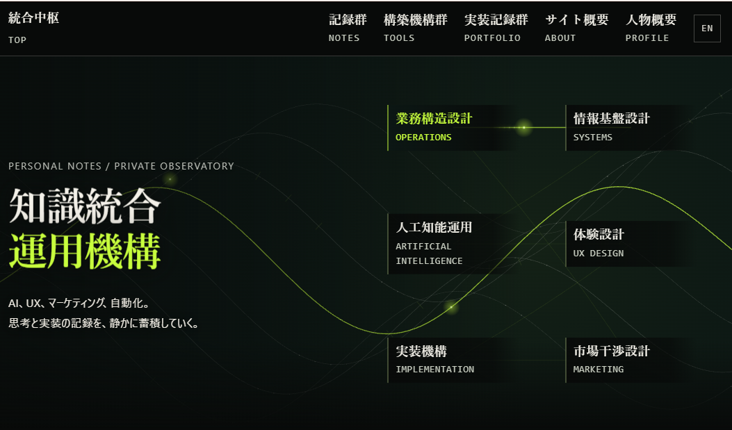
To preserve those differences, I gave distinct colors to Operations Design, Information Systems, AI Operations, Experience Design, Implementation Systems, and Market Strategy. At the same time, the background, typography, rules, spacing, and type styles share one design language.
The goal was not to make a separate site for each category. It was to show distinct disciplines connected to the same hub.
Show cross-domain integration through motion instead of explanation
The most time-consuming part was not polishing static screens but translating the concept into motion.
On the homepage, several waveforms cross the screen and connect six disciplines. Rather than radiating from a single center, the lines overlap, diverge, and intersect again. This represents how the disciplines are not self-contained: an insight in one field can influence another.
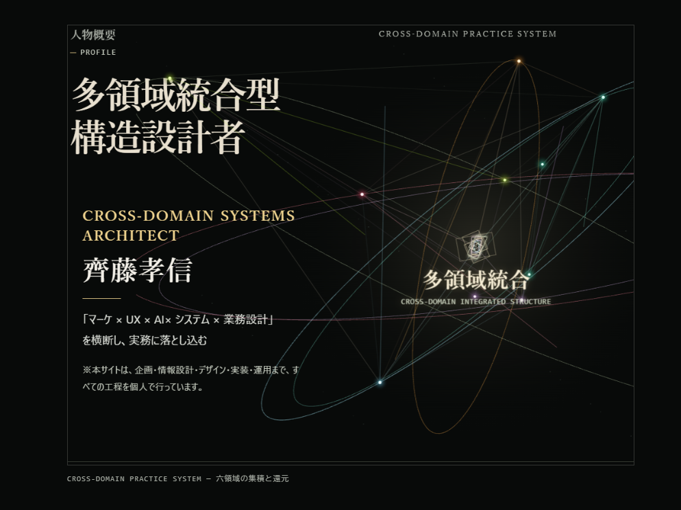
On the profile page, each of the six disciplines follows its own orbit, is selected in turn, and eventually converges at the center. The interaction does not stop at convergence; light flows back out from the center to each discipline.
Motion is not there to make the interface look elaborate. It makes relationships and cycles—ideas that are hard to explain with text alone—something visitors can explore and understand.
Connect articles, tools, and case studies as different views of the same practice
On the old site, articles took center stage while tools and the profile felt secondary. The redesign removed that hierarchy.
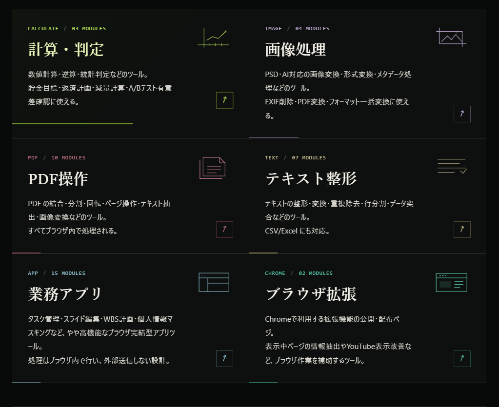
I reorganized the tool systems by use case: calculations and checks, image processing, PDF operations, text formatting, business apps, and browser extensions. This is more than a list of tools. It shows how ideas from articles and friction from real work have been turned into things people can use.
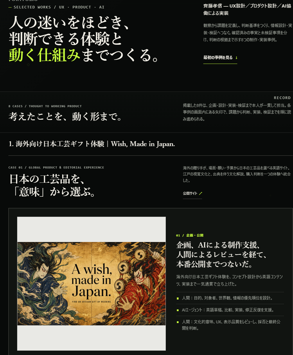
The implementation case studies do more than display finished screens. They show what I observed, how I made decisions, what I built, and how I verified it. I handled every featured project end to end: planning, information architecture, design, implementation, and operations.
A single practice can produce an article that records a decision, a tool that makes a repeatable process usable, and a case study that documents the result and its verification. They look different, but each is another view of the same practice.
Practice does not end when something is published
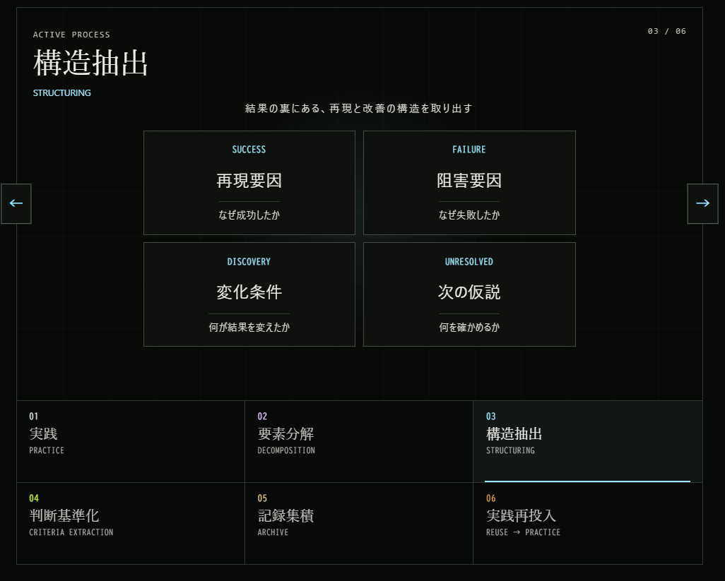
The site overview describes, in six stages, how I carry practice forward.
01 Practice, 02 Break it down, 03 Extract a structure, 04 Define decision criteria, 05 Accumulate records, 06 Feed it back into practice.
If you stop after labeling a project a success or failure, the experience remains one-off. Break down the result into what was repeatable, what got in the way, what conditions changed, and what to test next. Preserve those as decision criteria to give the next project a stronger starting point.
That is why the six stages do not end at the last step. They form a loop from 06, feeding learning back into practice, to 01, starting the next cycle.
The renewal was not a direct implementation of the first design
I built the screens and reviewed them on desktop and mobile, checking spacing, readability, date placement, navigation consistency, and how animations began. When an intended slide-in felt choppy, I revised the implementation. When header heights differed across pages, I adjusted the shared structure.
The renewal was not a direct implementation of the first design concept. It came from making decisions through short cycles of building and observation.
It took two days because of preparation, not because I skipped thinking
The full redesign took two days. But I do not want to frame that fact as a story about speed alone.
I could restructure the whole site in a short time because its articles, tools, case studies, and decision criteria had already accumulated. I did not invent the content from scratch; I revisited the pieces that already existed and reorganized them into a structure that represented my work more accurately.
It also helped that I could move continuously through planning, information architecture, design, implementation, and verification instead of splitting them among different roles. There was no need to translate intent between a designer and an implementer. I could adjust the design around code constraints and revisit the information structure when something felt wrong on a real device.
I also used AI as a production aid. But I decided what to express and preserve, what felt wrong, and what counted as finished. It is more accurate to say I used AI to implement and test my decisions quickly than to say AI did the work for me.