Amazon ad keyword analysis,
a dashboard that connects wins and losses to the next test candidates
Simply putting ad data into a table does not readily lead to the next decision. Even after checking sales, ad spend, ROAS, and orders, I still need to decide which messaging angles to keep, which keywords to pause, and what to test next.
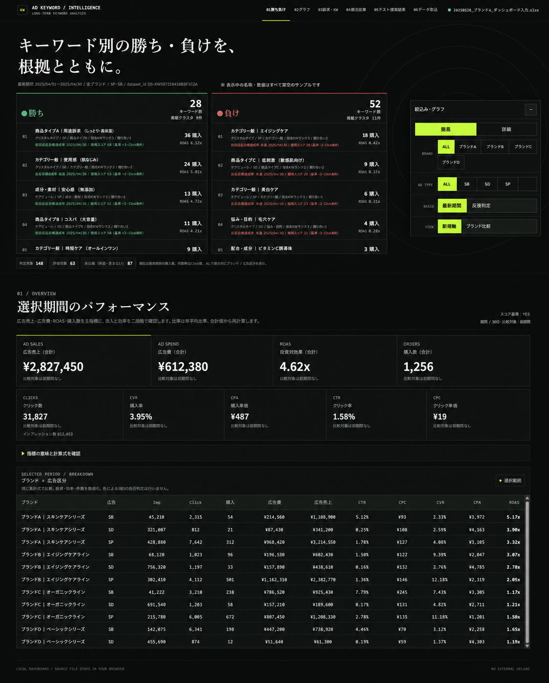
So I built a dashboard that loads the final weekly Excel file once in the browser. It keeps messaging angles, natural-language keywords, and product targets separate, while showing repeated wins and losses and candidates for the next test.
Define the Units of Analysis Before the Charts
Even when we call them “keywords,” search terms, product targets, and SD campaign proxies mean different things. Combining them in the same table can make it easy to misread what worked.
This dashboard treats messaging angles, natural-language keywords, SP/SB product targets, and SD campaign proxies as separate units of analysis. It then lets users filter by brand, ad type, and time period consistently.
The first thing to define is not a polished visualization. It is which things belong in the same comparison group.
Load Excel Once and Keep the Data in the Browser
The update starts with one verified, final Excel file. After it is loaded, each tab uses the same in-memory data, so the workbook is not parsed again every time the user changes screens. A new file is loaded explicitly only when replacing it with the following week’s data.
The tool runs entirely in the local browser without uploading data externally. For work involving data that must be carefully controlled, such as advertising data, this should be an initial constraint.
All brand names, product names, messaging angles, dates, amounts, and KPI values in this article have been replaced with fictional samples. They do not represent real companies, products, or advertising results.
Separate Metrics from Meaning Behind the Clicks
The first thing I designed was not the dashboard screen. It was the workflow for receiving weekly exports, keeping them consistent with earlier data, adding meaning, and returning the result in a form that supports decisions.
Python checks the periods, columns, and values in the raw CSV and tracks differences from the previous import. It avoids double-counting overlapping periods in totals and scores, aggregates by target ID, and calculates weekly win-loss votes against a baseline that excludes comparable items with the same conditions. This is where the authoritative numerical dataset is fixed.
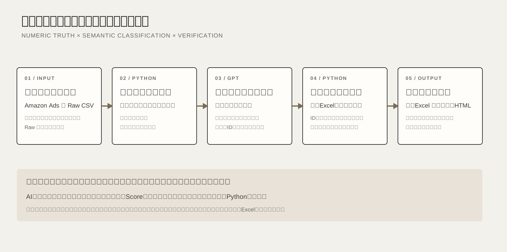
GPT receives only new keywords or unclassified items that need semantic labeling. In Excel, metrics, target IDs, normalized values, and existing entries are locked; only blank yellow cells can be edited. After the file is returned, the system checks the sheet structure, columns, IDs, row order, editable cells, injected formulas, changes to reference sheets, and execution version.
Only classifications that pass validation are merged into the authoritative metrics held in memory. Raw data is not recalculated at this stage, so the GPT round trip cannot change the numbers. Python also compares five core metrics before and after merging, then builds messaging-angle summaries, repeat-win/loss classifications, product-level profitability judgments, and prioritized candidates for the next test.
AI helps organize meaning. Python handles numerical aggregation, wins and losses, repeat scores, profitability checks, and test-candidate rankings. This division of work keeps the basis for each decision reproducible.
One High-ROAS Week Does Not Make a Winner
It is risky to call a target a winner based on one week of high ROAS. With few clicks or purchases, the result may be random variation.
Aggregate non-overlapping weekly periods and, when period lengths differ, prorate the minimum click threshold to a seven-day basis.
Compare conversion rate and ROAS against peers with the same brand, ad type, and target type.
If the baseline and peer comparison point in the same direction, record +1 for a win, -1 for a loss, and 0 for a close result that week.
Accumulate up to the latest 12 periods: a score of +3 or higher is a win, -3 or lower is a loss, and anything in between remains undecided.
Check click volumes for the target and its peers, and confirm that combined conversion rate and ROAS do not contradict the weekly classification.
This makes it possible to treat wins and losses as relative strengths repeated under the same conditions, rather than one-off numbers.
Move Between Conclusions and Evidence on One Screen
At the top of the dashboard are lists of wins and losses, along with ad sales, ad spend, ROAS, orders, clicks, conversion rate, CPA, CTR, and CPC for the selected period. This is where users can check the overall picture.
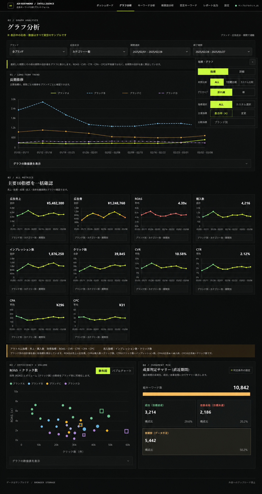
Next, users can view long-term trends and the ten main metrics on the same time axis. Even if ROAS improves, other metrics show whether orders declined, ad spend increased, or clicks were insufficient.
Do Not Conflate Relative Wins with Profitability
A target can outperform its peer group but still fall short of the ROAS goal. Conversely, even if it appears profitable, a small sample is not enough to declare it a winner.
Wins and Losses
- Differences in conversion rate and ROAS versus peers with the same conditions
- Weekly cumulative score
- Amount of evidence, including the comparison group
Whether to Act
- Whether the target ROAS or acceptable ACOS is met
- Whether enough clicks can be gathered
- Whether the product, messaging assets, and operating capacity are ready
Separating these two questions prevents the fact that a search term generated sales from being mistaken for proof that the ad copy itself caused them. It keeps the strength of the evidence separate from the business’s profitability.
Turn Undecided Items into Test Candidates, Not a Backlog to Ignore
An undecided result is neither a failure nor a success. It signals an opportunity to gather more information: there may be too little data, too few tests, or no product mapping yet.
So the dashboard scores product and meaning fit, information gaps, similar past results, feasibility, and coverage or novelty to rank candidates for the next test. Targets with a well-established pattern of wins move to the action list instead of being suggested for another test. From the undecided items, it selects those likely to produce the most learning.
The dashboard is not meant to create more numbers. It helps find where decisions get stuck and makes it possible to choose a small next step.