Turn “completely useless” into
Make Them See It Through.
A fictional government agency somehow selects you as a candidate for its highest office. You pass the first screening without applying and are made to complete five useless practical tests in order. This experimental site uses a neo-brutalist visual style. I created the concept, world, copy, UI, implementation, and launch on my own in a single day.
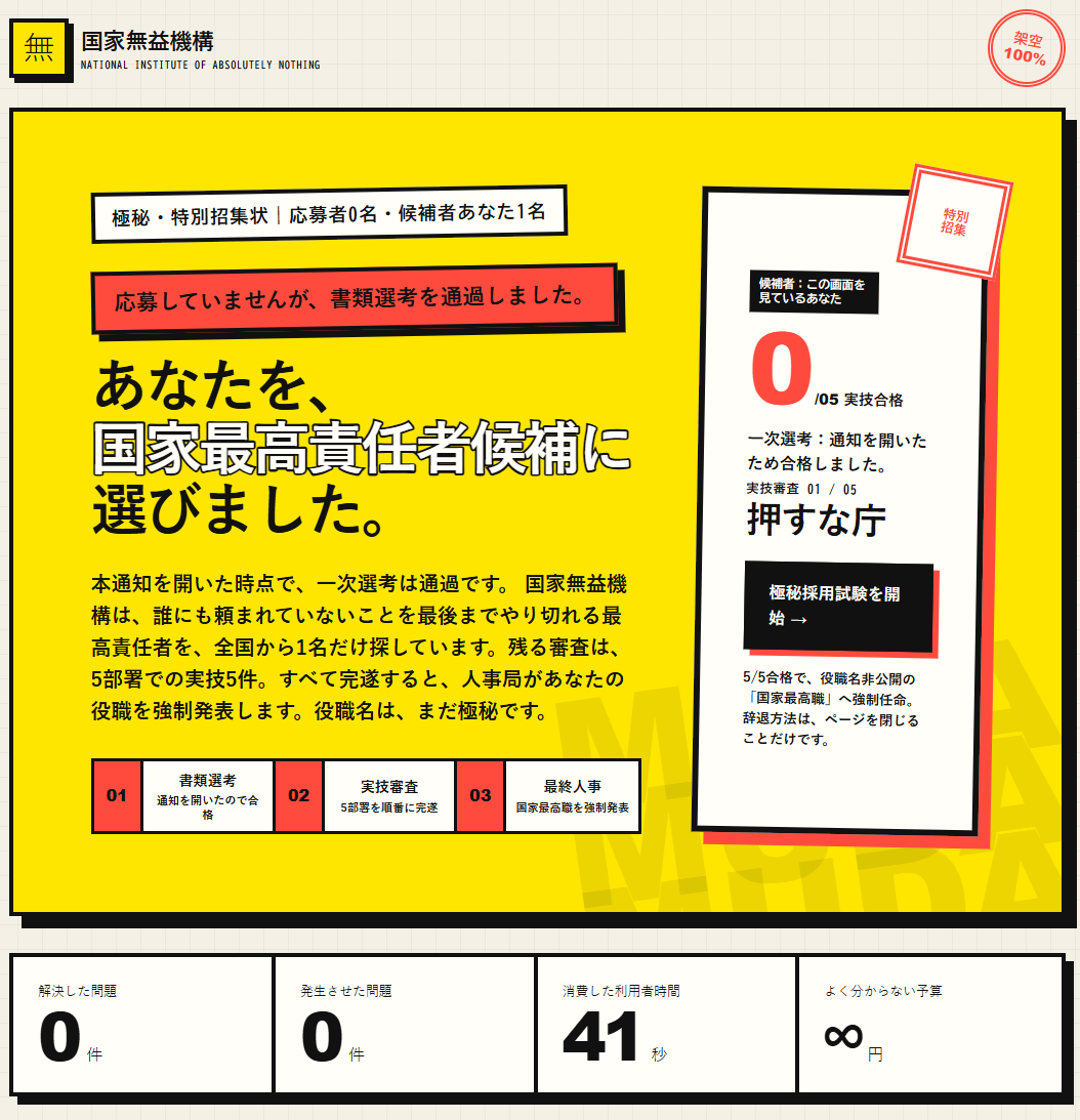
Before reading the explanation,
the test has already begun.
The idea behind the site was: “What if we gave something completely useless a full UX treatment?” But if visitors only read the copy, they might laugh once and leave. So opening a notification immediately makes them pass the first screening and turns them into participants.
The copy says the only way to decline is to close the page. A 0/5 progress counter and a locked next department make visitors curious about what comes next, even though they know it is pointless. The UX is not about achieving a useful goal; it is about the pointless urge to see it through.
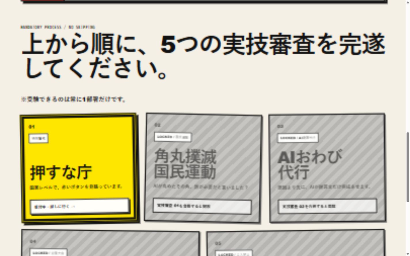
Even a meaningless interaction
Progress, prohibition, and a preview of what comes next can make people want to see it through.
Keep saying “Don’t press it,”
and make people want to press it.
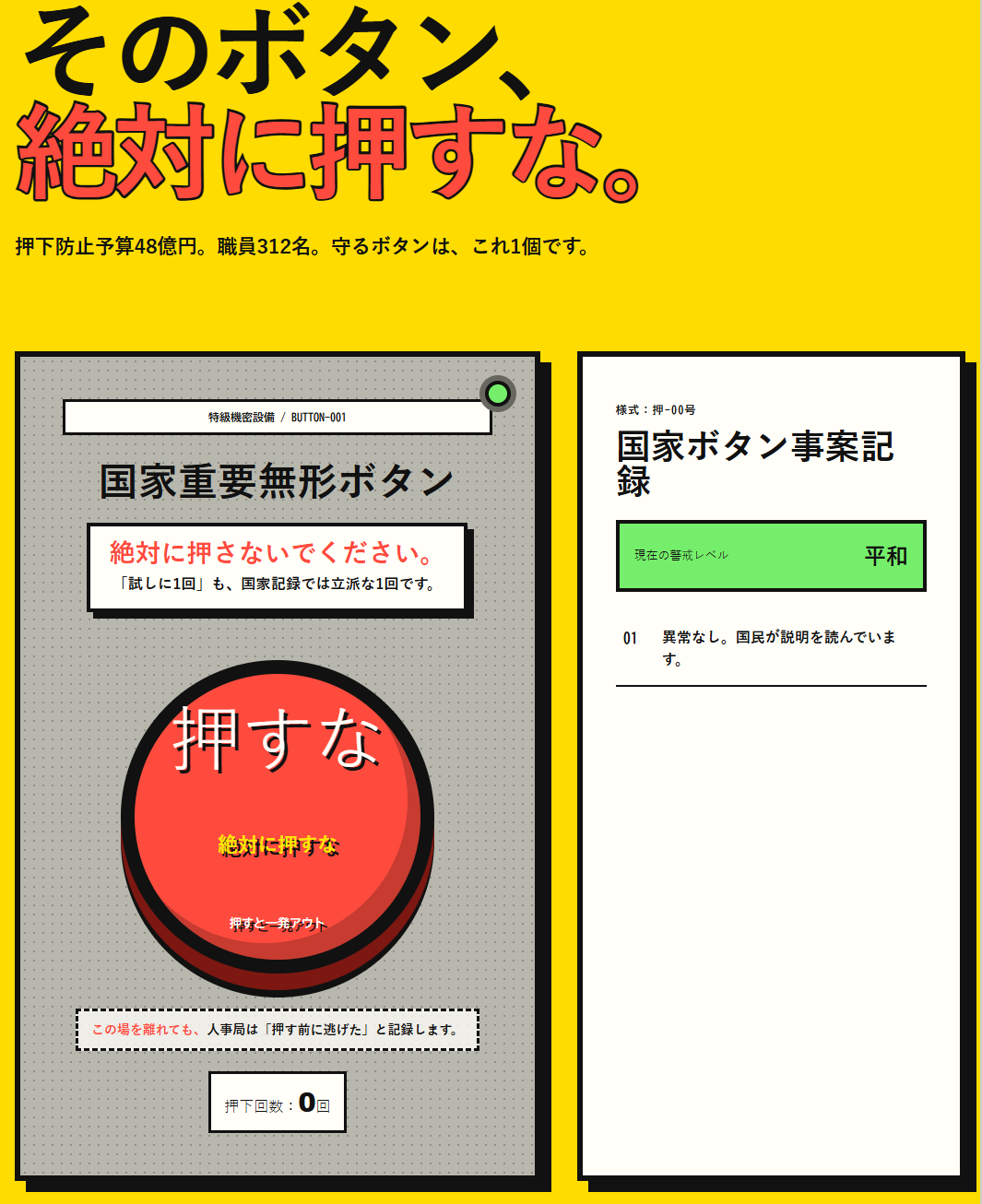
The first department, the “Do Not Press Bureau,” reverses prohibition and persuasion. A huge red button, excessive warnings, and a fictional enormous budget for preventing clicks all direct attention to the same button.
The copy leaves no escape: whether you press the button or not, the personnel department will record it. Breaking the prohibition becomes the success condition for moving on to the next test. Here, UI components serve as props in the story, and a click triggers the next scene.
Take neo-brutalism
beyond its visual style.
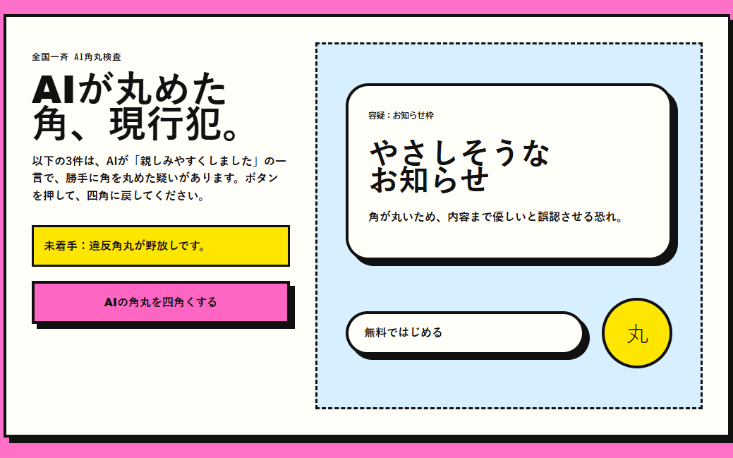
I used the visual language of neo-brutalism: thick black lines, primary colors, offset shadows, and oversized type. But it is more than a visual reference; it conveys the pressure of a government institution that moves ahead without consent. The forceful screens make visitors feel that they were not given a choice.
Each department changes its colors and screen language, creating a small surprise with every new test. Ideas such as eradicating rounded corners, AI-powered apologies, and a national championship of trivialities turn familiar oddities in AI and UI into jokes you experience through interaction rather than explanation.
- Just add thick lines and primary colors
- The meaning of the screen does not change
- Little reason to keep going after the first look
- Thick lines become government pressure
- Copy and interaction share the same premise
- Each department’s change motivates the next step
Build a complete story,
not just a single joke.
The first reversal: the more you are told not to press it, the more you want to.
Eradicate rounded corners, get AI to apologize, and compete in a national championship of trivialities—each action delivers a different joke.
Warn visitors to close the page while creating tension that makes them want to continue to the final personnel decision.
Turn every interaction into a reason for appointment and force the visitor into the role of the first and lifetime Prime Minister of Nothing Useful.
Speed comes from removing uncertainty about the world of the experience,
not from writing more code.
I was able to finish and launch the site in one day not because I built many features, but because I first committed to the world of the National Institute of Absolutely Nothing and one experience that forces visitors to participate. The copy, screens, colors, and interactions could then all be guided by that premise.
AI can speed up implementation and production. But people decide what should be funny, where to create caution, and when to prompt an action. The more I use AI, the more concept and experience decisions determine how fast the work moves.
National Institute of Absolutely Nothing / National Institute of Absolutely Nothing — Sources for screenshots and the experience discussed in this article.